
Tutorials and help
Three toolbar buttons teach you the app rather than change your design: Tutorials walks you through a task, Help labels whatever is currently on screen, and Updates tells you what has changed since you were last here. None of them touches what you have built.
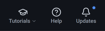
Tutorials
Section titled “Tutorials”What it is. A dropdown listing the guided lessons, each with a one-line description, a rough length in minutes, and a tick once you have completed it. Desktop only - tutorials teach building, which is a desktop activity.
What it does. A tutorial runs inside the app, on a small prepared scene, and coaches you through a real task step by step: a highlight sits over the control to use, and the step completes when you actually do the thing rather than when you press Next. Steps you only need to read carry a Next button; Exit leaves at any point.
Options and limits. Three tutorials ship today - placing your first component, grouping and arranging, and a quick tour of the interface - and each takes a couple of minutes. A tutorial cannot be started from inside the custom-object editor, or once a free session has run out; finish or leave what you are in first. The interface tour needs a window wide enough to show the whole toolbar at once, and greys itself out with a hint rather than pointing at controls that have been pushed off the edge. The tick beside a completed tutorial is remembered on the device you took it on, not on your account, and it is only a hint - you can re-run any tutorial as often as you like.
What it affects. Nothing of yours. Starting a tutorial parks your design and its undo history and swaps in the tutorial’s own scene; finishing it, or exiting early, puts your design back exactly as it was, history included. Your free session clock is paused for the whole tutorial, so learning does not cost you build time.
What it is. A mode rather than a panel. Pressing Help dims the editor and draws a box around every control currently on screen.
What it does. Hover a box and a short explanation of that control appears beside it. It is the fastest way to answer “what is this button?” without leaving what you are doing.
Options and limits. The overlay is inert: while it is up, the controls beneath it do
nothing, so you cannot fire a button by exploring it. What is boxed is what is mounted - so open a
menu, or select an object, and press Help, and the menu’s rows or the Inspector’s fields are
explained too. Done, or the Esc key, leaves the mode. Desktop only.
What it affects. Nothing. Help never changes your design.
Once these reference pages cover a control, its box also links here: pressing the boxed control opens the page documenting it, in a new tab. Controls whose page is not written yet are boxed and explained as usual, and do nothing when pressed.
Updates
Section titled “Updates”What it is. The release notes, in the app. The button wears a dot when there is a release you have not seen.
What it does. Opens a list of releases, newest first, each expandable to its notes; the newest one starts open, so the modal answers “what’s new” without a press. A second tab, Planned features, teases what is being worked on next, with a link into the feedback form to suggest something.
Options and limits. Opening it clears the unread dot. The list is the same one published on the website’s updates page.
What it affects. Nothing in your design.
Related
Section titled “Related”- The toolbar - where all three buttons live.
- Guides: in-depth walkthroughs - longer, written versions of what the tutorials teach.